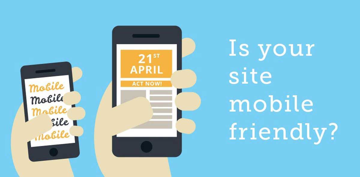
Mobile Strategies Must Address User Expectations
Mobile User Behavior Shows Shorter Attention Span
As the smartphone and tablet market continues its explosive growth, businesses are discovering the importance of understanding the web-browsing behavior and actions of mobile users. While desktop users still surpass mobile visitors to your website, mobile web usage is expected to eclipse desktop usage by the year 2015. Savvy businesses are already monitoring mobile user behavior patterns in order to optimize their browsing experience for maximum conversion performance.
As the smartphone and tablet market continues its explosive growth, businesses are discovering the importance of understanding the web-browsing behavior and actions of mobile users. While desktop users still surpass mobile visitors to your website, mobile web usage is expected to eclipse desktop usage by the year 2015. Savvy businesses are already monitoring mobile user behavior patterns in order to optimize their browsing experience for maximum conversion performance.
Not all Markets are the Same
The percentage of mobile users viewing your site will depend on the target demographic and market sectors targeted by your business. Restaurants for example will attract a much higher percentage of mobile users than restaurant purveyors. It’s important to have good web statistics in order to assess your current traffic and to plan accordingly.
Content – Less is More
Since mobile users want to cut to the chase quickly and typically have a lower patience threshold, it’s important that the content presented be limited to only the most critical information. Extended content can be made available but by user request.
Bold, Easy-to-Use Navigation
Avoid making it hard for users to navigate your menus. Present mobile-optimized menus that are large and easy to navigate with one hand. The home page should contain all the primary links dominantly displayed. Deploy a search tool if you have a lot of content or products.
Make it Fast for Visitors to Convert
To convert more visitors to customers, or browsers to buyers ensure conversion is done in the fastest way possible with the minimum number of intermediate clicks. If for example the goal is for the visitor to place a phone call to your company, ensure there’s a large CALL button on the home page or in the header. If the purchase of one or more products is the goal make it easy for buyers to complete the transaction with the minimum number of clicks and while eliminating any navigational elements that might confuse the user.
Javascript or Flash?
Some devices, like the iPad, iPod and iPhone lack the ability to display Adobe Flash content, so if your site contains Flash then device detection and alternate content strategies need to be used. Javascript and HTML5 Canvas can be deployed to fill the void.
Take Heed of Speed
Depending on the cellular technology and signal levels, mobile bandwidth may sometimes be slower than wired desktop computers so ensure that images, buttons and scripts are sufficiently lightweight for fast page loads.
Tablets vs Smartphone vs Desktop Computers
When it comes to tablets, we find that tablet user behavior is similar to that of desktop users with more time being spent browsing a site than that spent by smart phone users.
Mobile user behavior will continue to evolve as smartphone performance and capabilities increase, but for now businesses must recognize that mobile users require navigation and content that is faster, leaner and gets the job done quickly.
Contact Us today to discuss how Acorn Interactive can help your business grow.
Learn More